
SeiBella: From Hidden Gem to Headliner

At-A-Glance
Seibella, Melaleuca’s newly rebranded beauty line, required a modern e-commerce platform to drive sales and build its identity as an independent brand. We leveraged extensive user research, iterative prototyping, and usability testing to design a high-performing website. The result? A 35% increase in sales and 38% reduction in bounce rates within the first six months
Note: I-Plan, is a custom digital tool launched a year before this project. It helps students map out their academic path to graduation. By 2019, all students were required to pre-plan their courses using I-Plan all the way through graduation.
The Problem Space
Melaleuca’s beauty line, Seibella, struggled to attract attention amid the company’s vast product catalog. As the Seibella line grew significantly over the past year customers remained unaware of Seibella’s offerings, and existing users often found the beauty products difficult to discover. The challenge was to create a dedicated, visually engaging platform that would:
Boost brand visibility in a competitive beauty market.
Increase sales of Seibella’s flagship skincare, hair care, and cosmetics products.
Create an immersive user experience distinct from Melaleuca’s other product lines.
Research
Given Melaleuca’s large resources, we were able to conduct in-depth research to understand Seibella’s current and potential customer base. Our research process consisted of:
- Surveys: We distributed a detailed survey to over 500 Melaleuca customers, including both current users and potential new customers of Seibella. This survey captured preferences on sustainability, ingredient transparency, and personalized shopping experiences, providing quantitative insights that informed our findings.
- In-Depth Interviews: To gain deeper understanding, we conducted one-on-one interviews with 25 customers across different demographics and lifestyles. These interviews allowed us to explore motivations behind purchasing choices, perceptions of Seibella as a brand, and pain points in the typical beauty shopping journey.
- Data Analysis: Leveraging Melaleuca’s extensive database, we performed data analysis and journey mapping on customer purchasing patterns and engagement. This provided additional context around the frequency of beauty product purchases, frequent interests, and repeat purchase behaviors.


Identifying the key persona
Based on the extensive research and insights, we developed a primary persona for Seibella’s e-commerce platform—Julie Carter, a mother and entrepreneur who looks for beauty solutions that fit into a fast-paced lifestyle and that are both sustainable and clean. She refers simplified shopping experiences with clear, expert-backed recommendations.
Emily seeks high-quality beauty products with transparent ingredient sourcing and eco-friendly practices that match her environmental values.
She strives to invest in trustworthy, effective beauty solutions that reflect her commitment to sustainability, without compromising on luxury or performance.
Seibella’s platform provides an opportunity to engage Emily with a personalized shopping experience, including detailed product descriptions, transparent sourcing practices, and streamlined checkout processes.
Emily faces frustration with greenwashing, misleading sustainability claims, and hidden ingredient lists. She also finds long, complex checkout processes and inconsistent product quality challenging.

Additional research findings
of eco-conscious shoppers are willing to pay a premium for sustainably sourced beauty products.
of busy professionals preferred guided recommendations over browsing large catalogs.
of first-time shoppers wanted clear educational content, such as how-to guides and ingredient explanations.
of repeat customers prioritize brands that transparently disclose their sourcing and production practices.
building the experience
Phase 1: journey mapping and ia
We started by creating a user journey map to understand the steps Seibella’s customers would take—from discovering products to completing a purchase. This process highlighted key decision points, potential pain points (e.g., complex checkout), and opportunities for engagement, such as through dynamic product highlights or personalized recommendations.
Next, we built the information architecture for the site, ensuring clear, intuitive navigation. The IA focused on simplifying product discovery by structuring categories like skincare, haircare, cosmetics, and fragrance. Filters were also integrated to help users refine their searches based on specific needs (e.g., ingredient preferences, product type).
Phase 2: Concept Validation
Once the journey mapping and IA were validated, we moved to low-fidelity wireframes to test layouts and navigation paths. Through remote tree testing with 50 participants, we confirmed that a dedicated product category structure (Skincare, Haircare, Cosmetics) simplified navigation and made product discovery more intuitive.
With Melaleuca’s existing platform primarily focused on wellness, the challenge was to make Seibella feel like a high-end beauty brand, while still reflecting its roots in eco-conscious, affordable products.
Early prototypes received mixed feedback—42% of users felt the look was too clinical, and 35% found it visually too similar to Melaleuca’s broader catalog. To resolve this, we refined the aesthetic, infusing bolder typography, vibrant imagery, and playful elements that appealed to our core persona.


Phase 3:
High-Fidelity & Iterative Testing
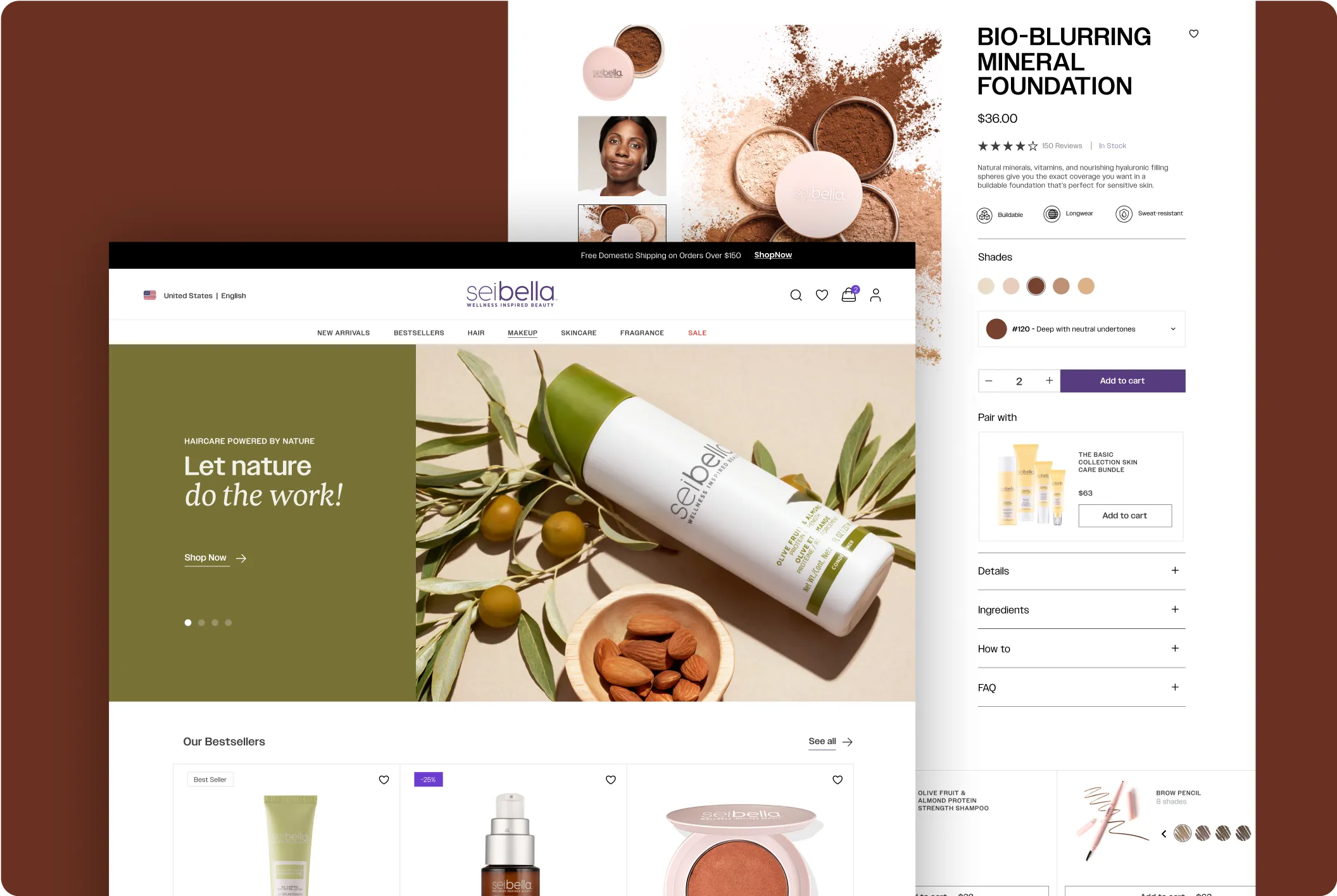
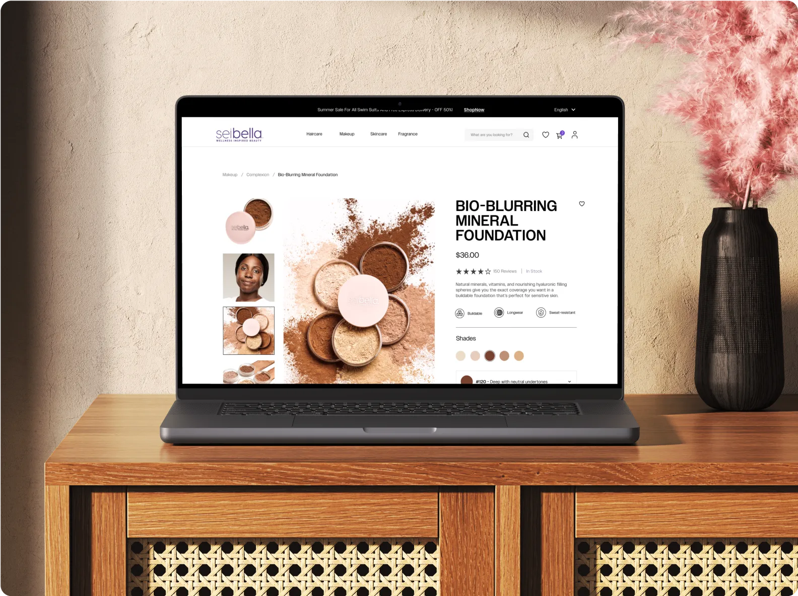
In Figma, I designed high-fidelity prototypes that reflected not only Seibella’s brand identity and user-focus but also incorporated a strategic business layout focused on increasing sales and boosting brand visibility. The design aimed to showcase Seibella’s key products while promoting its unique value proposition as an eco-conscious beauty line.
- Dynamic Homepage Banners: Updated monthly based on sales data, stock levels, and product profitability, highlighting key promotions, and ensuring that the most relevant items were always at the forefront.
- Product Prioritization: Featured high-margin products and new launches within strategically placed categories like skincare, cosmetics, and haircare.
- Flexible Layout for Product Promotions: I created a flexible layout that enabled the business to quickly highlight seasonal promotions, new product launches, or limited-time offers. This agility was built into the backend, ensuring that the business team could easily update banners and content to match changing sales strategies without needing a full website overhaul.


User Testing
We conducted usability testing with 28 Melaleuca costumers and 12 non-Melaleuca beauty shoppers focusing on the final design’s key elements, such as category navigation, dynamic product banners, and a streamlined checkout process. Some findings included:
of users engaged with the homepage banner, interacting with featured product highlights as intended.
of users added products to their cart after using the filters to navigate the skincare section, confirming the ease of navigation.
This testing validated the design's effectiveness in driving engagement and conversions.


results and impact
After the Course Planner launch, 80% of surveyed students reported a more streamlined experience. Additionally, system crashes due to peak loads were reduced by 30%, as more students planned and registered earlier.
increase in sales in the first 3 months compared to same months on previous year.
increase in repeat purchases, attributed to personalized product recommendations and targeted promotions.
increase in sales of products that Seibella was displaying on the home page.
Post-Launch Insights revealed that Seibella’s skincare line dominated user interest, driving significant engagement. This success was followed closely by the newly launched hair products, an outcome that aligned perfectly with the marketing team’s goals. Having invested heavily in R&D for these products, the team’s strategy was to increase visibility and adoption.